
The correct way to design and lay period floors
How we differ from most period tile suppliers
A period floor is made up of 3 main components - the pattern, the border and the fill.
Examples of how your period floor could look without proper knowledge, advice and planning.
Here are some examples to show why we often draw period floor designs to scale using CAD software - it helps us and the tiler plan the design better which makes it look much nicer, avoid awkward cuts or pinch points and often use fewer tiles as we are able to know exactly how many you will need, rather than just supplying based on maths.
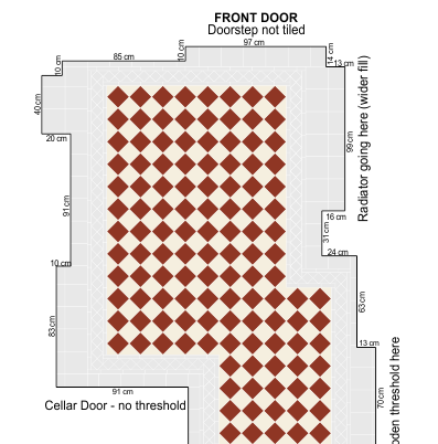
The problem
The pattern "runs out" and is cut by the walls/shape of floor
In example , we use a rectangle of a fixed width all the way around. Without using the flexibility of fill we run out of room and the pattern is cut off awkwardly. The more pipes, kitchen units, radiators, and uneven parts of floor, the worse it would look.
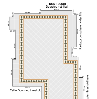
How we would solve it
Supply the correct tiles to be used as fill
Fill is nearly always supplied as 6x6" square tiles that are cut down to suit. Fill helps acommodate uneven walls, avoid awkward cuts and can be manipulated (making one side slightly wider than the other) to make a pattern symmetrical.
Example shows what it should look like if designed and tiled properly.
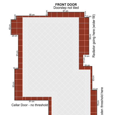
The problem
The border follows the room but the pattern will not fit properly
We make sure the pattern fits nicely and is as symmetrical as possible, avoiding awkward cuts and the pattern not fitting properly. Example shows that it is technically possible to snake the border around the room and fit the pattern in.
How we would solve it
Draw the room to scale and see what would fit - giving the customer a preview and offering honest advice.
Example shows how we would design the area - with symmetry and the fit of the pattern in mind. We'd rather be honest with a customer and advise them to change designs or have a more "plain" border than try and make it work anyway if the floor will look bad and it will make the tiler's job harder.
The problem
The pattern sits awkwardly - there are lots of cuts and it isn't neat
Example shows what the floor would look like without a proper design. If the tiles are supplied based on maths alone, the tiler has to "design" it as they go. The result of this can often mean the pattern finishes on unsightly cuts and also will not be symmetrical where, if planned beforehand, it would have been.
How we would solve it
Design the floor so there are as few awkward cuts as possible and the pattern is symmetrical
Example is our design. The triangles can be supplied as full triangles, reducing work for the tiler and providing a nicer looking floor.
The problem
Using small squares in the border as a result of poor planning
Example is why these tiles aren't and shouldn't be mesh mounted. As we design and as the tiler lays the floor, we need to manipulate the grout joint widths to make the tiles fit together properly to form the pattern, look nice and avoid awkward cuts.
In this example, a smaller square than the rest of the border has to be used (at the bottom, in the middle) to allow for the rest of the squares to fit.
How we would solve it
Example is our design. We've adjusted the sizing of the grout joint widths and fill to acommodate the properly-sized tiles.
Case Study - Path and Steps in Cheshire
This is why we like to draw period floors to scale where it is feasible and makes sense to do so. In this example the customer wanted a chequerboard pattern and we took great care to design the steps to make sure we could fit in a chequer and not have any difficult cuts that could be seen as the customer walks up the path.
We drew the area to scale based on the tiler's measurements and sketch, and accurately laid out the tiles to make sure the pattern is symmetrical and nice-looking.